TimberTech Tree Care
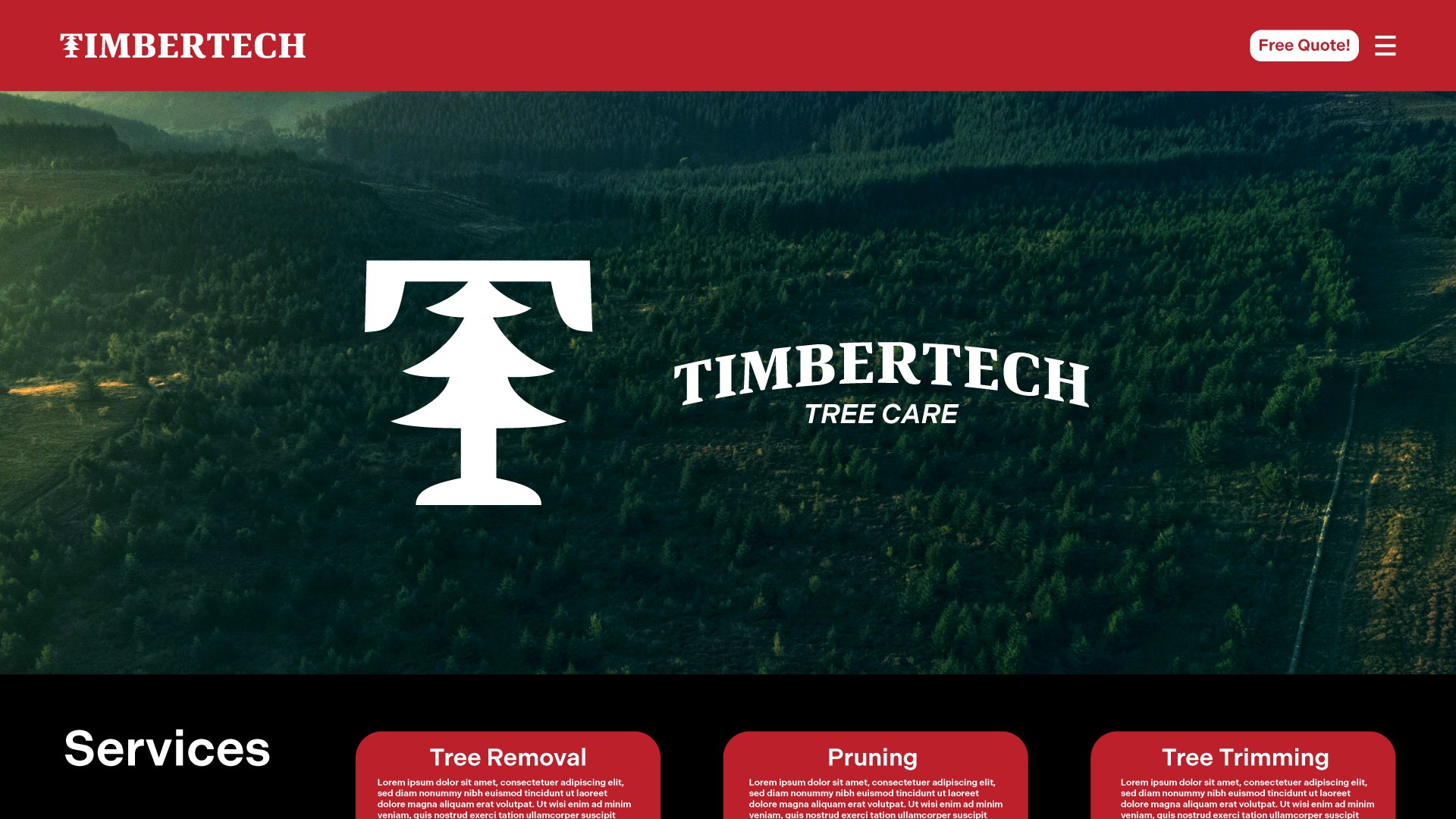
TimberTech Tree Care has served the Quinte region for 25+ years, providing expert tree removal, pruning, and land clearing. This rebrand modernizes their identity while maintaining their trusted reputation. The project enhances their digital presence for better client engagement.
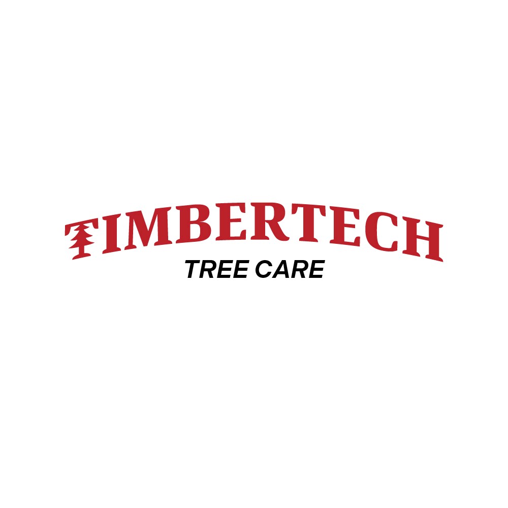
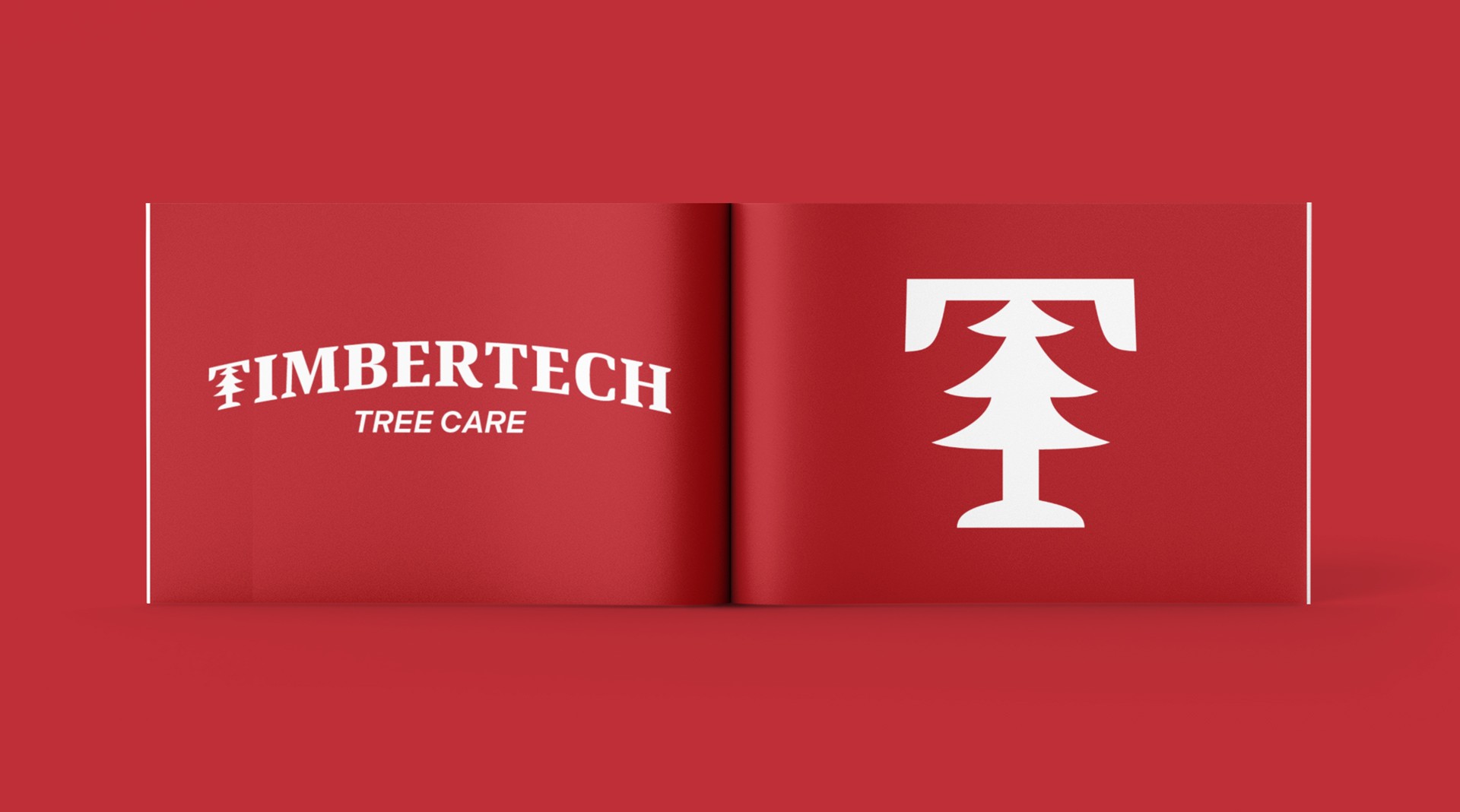
We designed a bold yet versatile logo that merges tradition with modernity, ensuring longevity and strong brand recognition. The serif typography conveys professionalism, while the slight arch nods to the company’s past identity with a refined, polished update. The custom "T" icon integrates a tree shape, creating a distinctive mark that works independently for social media and harmonizes with the full logo for broader branding. This adaptable identity strengthens TimberTech’s presence across digital and print platforms.
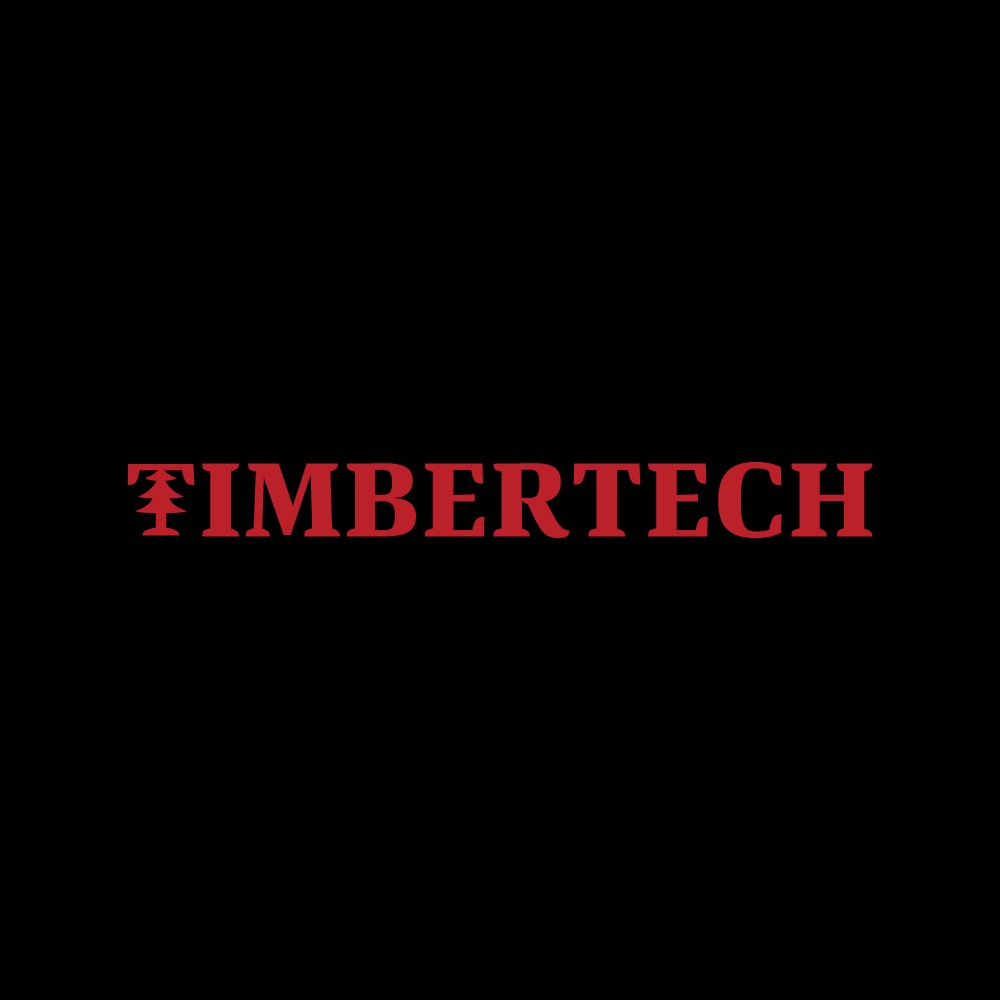
The new TimberTech Tree Care logo was designed to be bold, professional, and adaptable across all platforms. It features a creative logo mark and a slight arch, preserving elements from their previous identity while giving it a modern update. With a strong yet refined aesthetic, the design ensures brand recognition and looks great on social media and other digital platforms.
Summary
The TimberTech Tree Care logo strikes a balance between heritage and modern appeal. Its bold serif typography conveys professionalism and durability, while the subtle arch adds a dynamic touch that connects to the company’s history. The custom "T" icon cleverly integrates a tree icon, making it both memorable and versatile. Designed for adaptability, the logo maintains a strong presence across social media, print, and other brand applications.